Authored by David Stockman via InternationalMan.com,
It is now abundantly obvious that the FOMC and its clumsy rate-pegging and credit printing tools are not remotely fit for purpose.
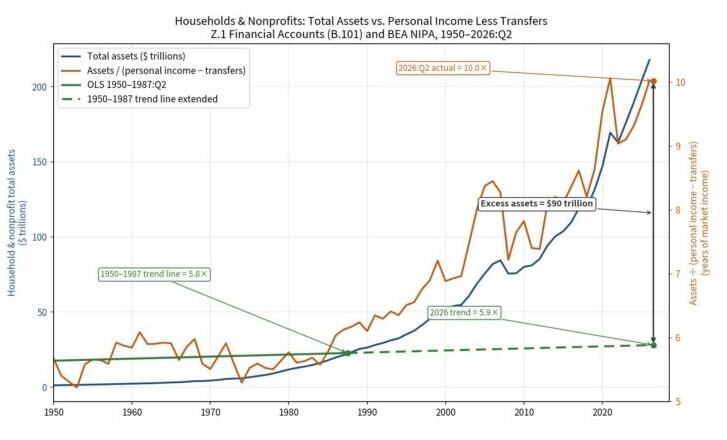
The real impact is dramatically displayed in the graph below. It shows that after 1987 the growth rate of household assets relative to earned income (i.e. excluding transfer payments) took off like a bat out of hell.
Indeed, as shown in the graph during the heyday of the 1950s through 1987, the nominal value of household assets tracked the growth of earned income almost in lockstep, with the ratio relatively flat through the 37-year period, posting at 5.8X in Q2 1987, up slightly from an average 5.4X ratio during 1950 to 1954, when the US economy moved into its strong post-WWII growth era.
The virtually nonexistent slope of the trend line (solid green below) during that era of unprecedented middle-class prosperity means that had it continued for another 39 years through Q2 2026, the end point ratio today would be just 5.9X, not the actual ratio of 10.0X.
So, yes, the Fed's red-hot printing press did make a whopping difference. To wit, the household and nonprofit sectors today hold the staggering total of $90 trillion more in assets of all types - from owner-occupied residences to cash accounts, bonds and stock portfolios - than would have been the case based on pre-1987 asset-to-income trends.
What this means is that the American household sector did not earn an