Wealth reflects the value of everything households own, including homes, stocks, businesses, and savings, minus what they owe.
Because different wealth groups own very different mixes of assets, long-term market trends can reshape how the nation’s wealth is divided.
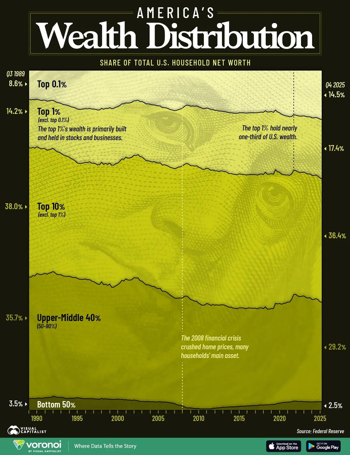
This graphic, via Visual Capitalist's Boyan Girginov, tracks how U.S. household wealth has shifted across wealth groups from Q3 1989 to Q4 2025 using data from the Federal Reserve’s Distributional Financial Accounts.
Wealth of the Top 1% vs. the Bottom 90%
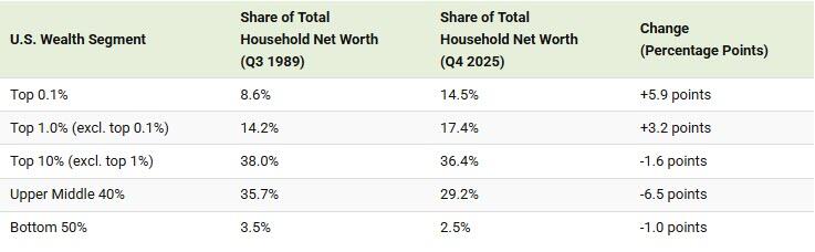
The table below shows how the wealth distribution has changed over the last 35 years:
The top 1% built its wealth primarily through stocks and businesses, assets that have soared in value for decades. In fact, every group below the top 1% has lost share since 1989: even the next 9% of households, from the 90th to 99th percentiles, slipped from 38.0% to 36.4%.
Wealth further down the ladder is tied mostly to the family home, which appreciates far more slowly than the stock market. Much of the bottom 50%’s net worth is home equity, and many households in that group have little or no net worth at all. That’s why the gap between the top and the bottom has widened over the last 3