A single graphic can be a powerful tool for clarity, but in the volatile atmosphere of Lewiston, Maine, it has become a lightning rod for accusations of statistical sleight of hand. Steve Robinson shared a contrasting map ofshooting incidents from 2019 to 2025against a pristine, 'zero shooting' map from the weeks following federal deployment.
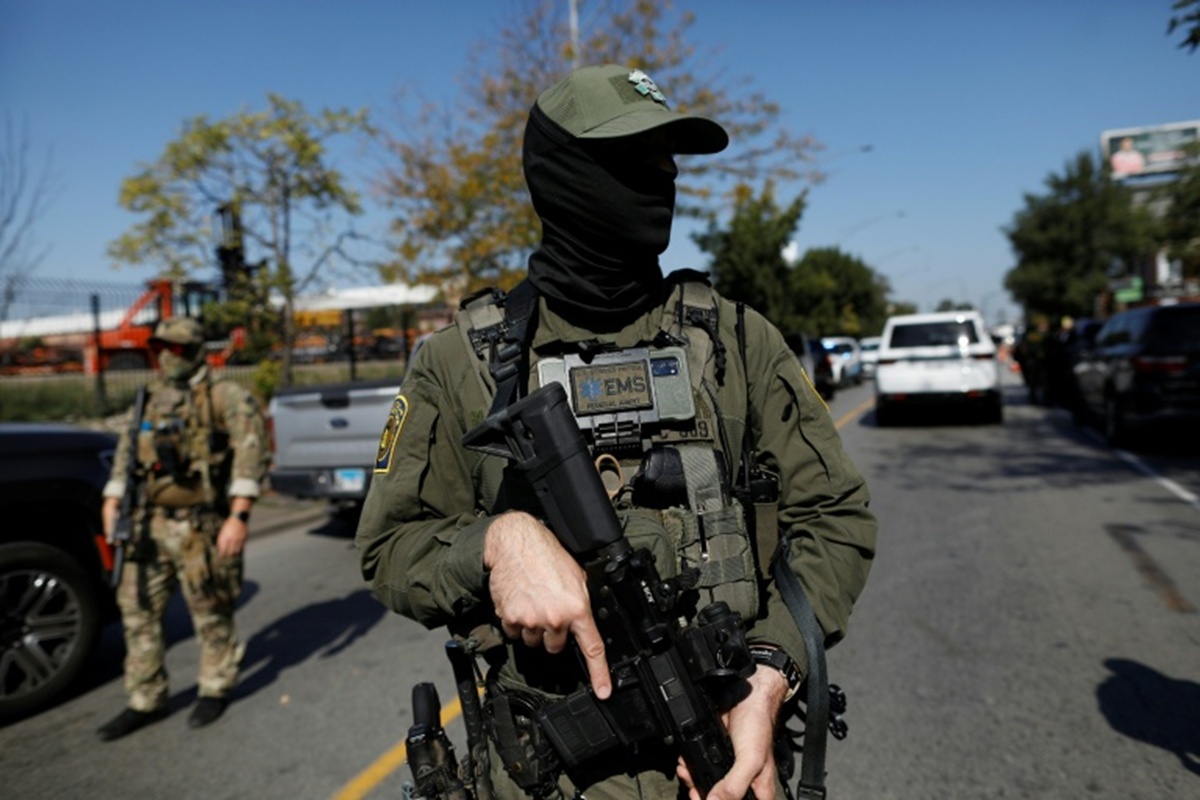
The number of shooting incidents in Lewiston, Maine, noticeably dropped when ICE agents were deployed in the area. Social media users, however, questioned the report's legitimacy due to its timeline. Apparently, they didn't think it was a fair comparison.
Robinson, an award-winning journalist and filmmaker, shared two graphics comparing the number of shooting incidents in Lewiston, Maine. The post featured two side-by-side graphics intended to show the positive impact of U.S. Immigration and Customs Enforcement (ICE) on local safety.
On the left, a map spanning 2019 to 2025 is saturated with red gun icons, representing years of shooting incidents. On the right, a 'post-ICE surge' map covering only late January to February 2026 displays a sparse handful of green house icons. This visual shift from weapons to homes implies a total restoration of order.
Homeland Security shared the post and was visibly proud of it. 'You're welcome,' the caption read.
The digital response to the graphic was swift, with many users accusing the government of statistical manipulation. Apparently, many find the graphic misleading for a few reasons: the pre-ICE map spans years of data, including the 'Covid spike', while the second map covers only a few weeks. Furthermore, there is no verified evidence directly linking ICE actions to a reduction in local shootings; correlation is not causation.
One user, @librarythingtim, noted, 'You're telling me that there were more shootings over six years than in the last month?', while another, @LikeToasters, added, 'Comparing years to weeks. Morons.'
You’re welcome.https://t.co/zyfUPey939
'It's misleading. Might be true, but it's a lopsided presentation,' a third user commented.
Many shared the same sentiment – that the presentation was biased. According to critics, the data was being weaponised to justify the federal presence without offering a fair historical context.
Source: International Business Times UK