Authored by Lance Roberts via RealInvestmentAdvice.com,
Last Friday closed with the 10-year Treasury yield at 4.60%, a one-year high, and the doom commentary about rising interest rates was waiting before the bell even rang. Hyperinflation. Bond market breakdown. Paradigm shift. A 1981 fair-value retest. The Fed is about to“push the brrrr button”or pop“the everything bubble.”If you spent any time on social media over the weekend that followed, you saw a version of every one of those.
So I posted a short thread that Friday, making a simple point. Over time, yields track growth and inflation. The chart that drew the strongest pushback roughly showed that relationship, and a wave of responses argued that the framework is broken, debt is about to break the bond market, supply-side inflation has changed everything, and rates have nowhere to go but higher.
However, let’s slow down and look at what the data actually says.Some of those critiques are weak. A few are partially right. And one of them deserves a serious answer.I’ll work through them in order. After 30 years of watching market cycles, the pattern in this setup is more familiar than most commentary suggests.
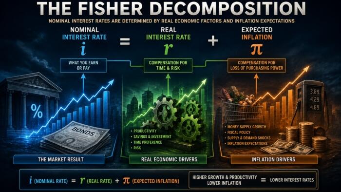
Start with the basic identity behind rising interest rates. Of course, a bond yield is what an investor demands to hold a piece of paper for ten years. That demand has two main inputs: the opportunity cost of economic growth and the inflation rate that erodes the dollars being repaid. If real growth is 2.5% and inflation is 3.5%, then a 6% nominal yield breaks even before any term premium.The investor isn’t going to lend at 2% in a 6% nominal economy because that’s a guaranteed loss of purchasing power and a worse return than the broader economy offers.
Importantly, that isn’t a theory I invented. It’s the framework Wicksell wrote about more than a century ago, and it shows up cleanly in the data when you plot yields alongside nominal GDP growth, which is just real growth plus inflation.
Notice how closely the two lines move together. Through the 1970s inflation spike, both lifted. Then, through the Volcker disinflation that began in 1981, both fell. After that, through 30 years of declining inflation and slower trend growth, both drifted lower. Through the COVID shock, both swung. And as inflation rebounded in 2022 and 2023, yields rebuilt the relationship. In short, rising interest rates have consistently mapped to rising nominal growth, and the reverse has been true on the way down.
However, the relationship deserves a more precise statement than“yields track nominal growth.”Over the full 1953 to 2026 monthly history, the 10-year yield has averaged about 0.77 percentage points below nominal growth.Not above, below. So the right way to think about the framework is that yields run slightly below the nominal economy in a stable long-run relationship, and the gap between them has fluctuated within a band rather than collapsing or exploding.
Where does that put us now?Real GDP grew at an annualized rate of 2.0% in Q1 2026. Headline CPI ran 3.8% year over year in April.Together, that puts nominal growth on a 6.04% pace.The10-year at 4.60% sits about 1.7 percentage points belownominal growth,a gap roughly a full point wider than the long-run average. By the mean-reversion logic the framework implies, the fair value of the 10-year is closer to 5.3% than to 4.6%.
Therefore,yes, there is modest upward pressure on rates from here. However,that is a very different statement than“7% rates and a debt crisis.”It is a slow drift back toward a long-established relationship, not a paradigm shift.
Source: ZeroHedge News
